Color is back in home decor! OK, so it never really left, but in the world of tile the colors we’ve seen a lot of in the past decade have been white and gray. Both are play it safe colors, good backdrops for you to accessorize with other colors that might express your mood or personality. In terms of what feelings and moods colors convey, white seems to represent cleanliness and purity; gray seems balanced and conservative.
Lately, though, we’re noticing an increased interest in using colors other than white and gray to make a more expressive statement in kitchens and baths……going beyond the accessories right onto walls and floors. Blue is especially popular. It conveys tranquility and serenity in its lighter, softer tones. The darker blues, to me, seem to evoke a sense of security. We’re not talking the old 1960s blues here. We’re talking about glazes that have depth, color variation and texture.
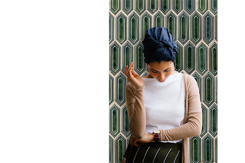
Green, which is my favorite color, speaks of nature, of freshness. Again, we’re not talking the drab greens of tile days past. We’re talking vibrant greens as well as the deeper jewel tones.
Pink is also showing up in tile manufacturer’s palettes. Think beyond the typical feminine connotation. To me it’s playful, joyful.
Reds, yellows and oranges are out in the marketplace as well. If thinking about all your bathroom walls clad in anything but white is too much for you, consider using a color on one wall only. Or in a kitchen with white cabinets, think about what color on your backsplash might “say.”
Of course we can’t forget classic and elegant black. I think black and white bathrooms are timeless, and with a splash of color on one wall, can be fun as well.

0 comments